
Colours have a huge impact on our mood and emotions. We’ll show you why it is so important to think about the psychology of colour when selecting your artwork.
1. What colours do you associate with certain emotions?
When we see colours, we automatically associate them with certain emotions and feelings. For example, blue is often seen as calm and serene, while red is associated with passion and anger. But why is this?
It turns out that the psychology of colour is a complex and fascinating topic. Different colours can evoke different emotions in different people, and even the same person can have different reactions to different colours at different times. There are a number of theories about why we react to certain colours in certain ways.
One theory is that it’s down to cultural associations. For example, in Western cultures, white is often associated with purity and innocence, while black is associated with death and mourning.
Another theory is that our reactions to colours are innate. This means that we are born with certain preferences for certain colours. This theory is supported by research which shows that babies prefer to look at bright, contrasting colours, and that young children show a preference for certain colours (such as blue and pink).
So, what does all this mean for artists? Well, understanding the psychology of colour can be a useful tool in creating art that evokes the desired emotional response in viewers. Of course, it’s not an exact science, and ultimately it’s up to the artist to decide which colours to use. But it’s interesting to consider how our reactions to colour are influenced by both nature and nurture.
2. The psychology of colour and how it affects our everyday lives
The psychology of colour has been studied for many years, and it’s amazing to discover the amazing influence it can have on our lives. Colour is known to affect our moods, emotions and behaviour, making it a powerful tool in art. By understanding the psychology of colour, artists can use this knowledge to create artwork that can evoke certain feelings and emotions.
The tonality of a piece of art also affects how we perceive it – whether it is positive or casual. Bright, cheerful pieces may be seen as optimistic or uplifting, whereas darker tones may be interpreted as being more sombre or mysterious. However, this does not mean that dark pieces cannot convey positivity – they can still evoke feelings of hope or strength.
Colour plays an important role in how we experience art on both a conscious and subconscious level. For example, certain colours may make us feel safe or relaxed; other colours may make us feel energised or excited.
Using patterns is another great way to incorporate colour into artwork while still keeping the overall tone light and happy. Whether the artist chooses subtle stripes or bold geometric shapes, patterns can add visual interest while still conveying positive vibes.
Another way to add life to artwork is by incorporating natural elements such as plants or animals — this will not only bring colour and texture but also invoke feelings of peace and comfort.
No matter what colours an artist chooses for their artwork, it’s important to remember that the psychology of colour can affect how people perceive the artwork. Understanding the emotions associated with certain colours can help artists create pieces that evoke the desired feelings from viewers.
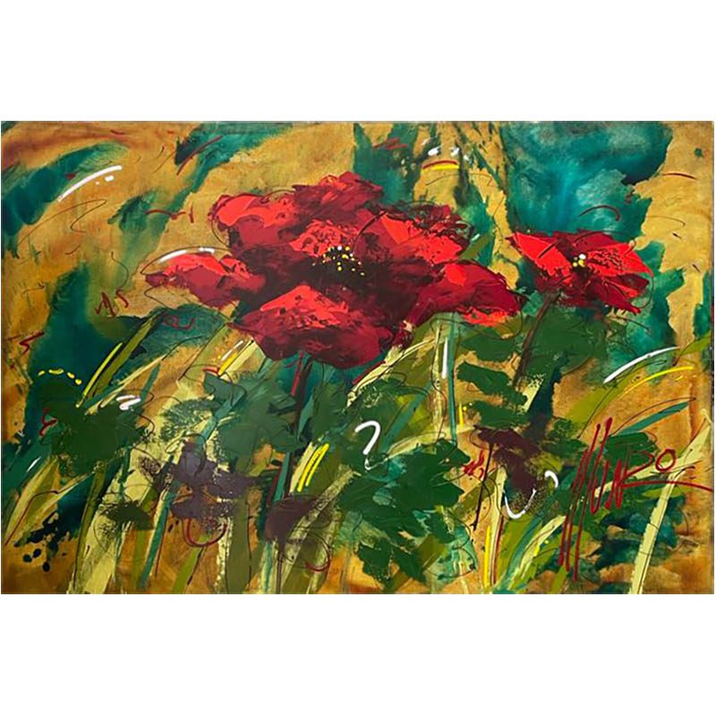
Red is associated with energy, passion, and excitement.
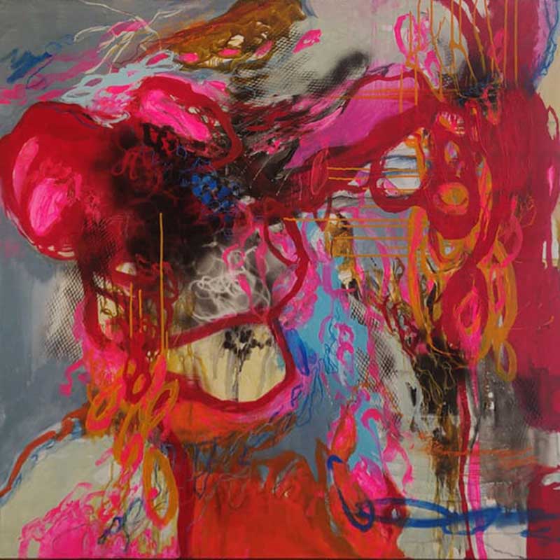
Red is a powerful colour, and when used in art it can evoke intense emotions. It is often associated with energy, passion, and excitement. Red is also often used to create a feeling of warmth and comfort. In nature, red can be seen in the sunset or sunrise, which may explain why it has such a positive connotation.
In art, artists use red to indicate vibrancy, joy and enthusiasm. Red can also be used to convey anger or danger. Artists often paint red walls or floors in order to create an atmosphere of tension or excitement.
Red can also be used to make a statement; for example, a bright red canvas may be used as an eye-catching feature or focal point.
Orange is associated with happiness, creativity, and enthusiasm.
Orange is one of the most vibrant colours in the spectrum and it is often associated with happiness, creativity, and enthusiasm.
This colour has been used in art for centuries to evoke feelings of joy, liveliness, and even rebellion. In the world of art, orange is considered a dynamic colour that adds a sense of movement and energy to a painting. It can also be used as an uplifting hue that encourages positive emotions.
In terms of psychology, orange is thought to influence our emotions by providing a stimulating environment that can motivate us to take action. In fact, research shows that when exposed to bright orange hues, people are more likely to be optimistic, energetic, and enthusiastic.
Orange also encourages creativity and boosts brainstorming capabilities which makes it ideal for use in art. On the other hand, toned-down shades of orange can create more subtle feelings such as warmth, comfort, and relaxation. Subdued oranges are often used in art as a way to evoke feelings of tranquility or serenity in viewers.
By combining different shades of orange together with other colours like blues or purples, artists can create stunning works of art that have both uplifting and calming qualities.
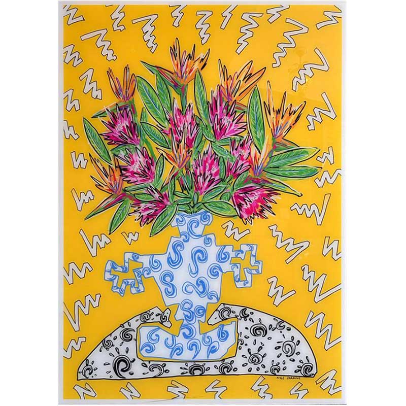
Yellow is associated with joy, optimism, and intellect.
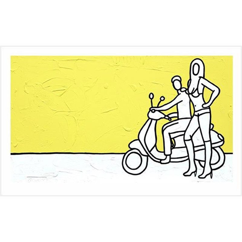
Yellow is a colour that’s associated with joy, optimism and intellect. It’s often seen as a warm, cheerful and uplifting colour.
In art, yellow is used to evoke feelings of happiness, optimism and hope. The use of yellow can be very effective in creating an atmosphere of positive energy and good vibes. When used in moderation, yellow can be a great way to create a casual tone. This is because it’s perceived as being less serious than other colours such as red or blue.
A light shade of yellow can be used to evoke feelings of relaxation and calmness. It’s also a great choice for creating a laid-back atmosphere in artwork. In nature, bright shades of yellow are often seen in sunshine, daffodils and other flowers. When used in art it can symbolise the joys of summer and the promise of happy times ahead.
Yellow is also used to represent intelligence and wisdom – making it an ideal choice for artwork that wants to convey intellectual ideas or concepts. Overall, the psychology of using yellow in artwork is one that emphasises warmth, joy, optimism and intelligence. It’s an excellent choice if you’re looking for an uplifting yet laid-back atmosphere within your work.
Green is associated with growth, nature, and tranquility.
Green is a colour that inspires relaxation and a sense of calm. It is often seen in nature such as the grass and trees, giving us an immediate connection to growth and revitalization.
When used in art, green can evoke feelings of tranquility and serenity. This makes it perfect for use in any artwork that wants to convey a positive and casual tone.
Whether it’s using pops of bright green or more muted shades, this calming hue can make a room feel more inviting and intimate. It is also known to help reduce stress levels by adding an air of relaxation to the atmosphere.
Overall, green is an incredibly versatile colour that can be used to convey different moods depending on how dark or light you choose to make it. From calming spaces to stylish outfits, this cheerful hue will always bring life wherever you choose to use it!
Blue is associated with peace, calm, and serenity.
The colour blue is often associated with qualities such as peace, calm and serenity. Blue has a calming effect on the mind and body, helping to reduce stress and anxiety. It can also be used to create a sense of space, allowing the viewer to feel more relaxed and comfortable in their surroundings.
Blue has been found to increase clarity of thought and concentration, making it an excellent choice for any creative project.
In the world of art, blue can be used to evoke feelings of tranquillity and relaxation. A blue painting or sculpture may offer a visual escape from our day-to-day lives, allowing us to take a step back and appreciate the beauty around us.
When used in combination with other colours such as yellow or green, blue can add depth and complexity to a piece of art, creating an atmosphere that is both calming and inspirational.
Overall, blue is an incredibly versatile colour that can be used in many different contexts with positive results. Its ability to evoke feelings of peace and tranquillity make it an ideal choice for those looking for a calming influence in their work or home life.
Conclusion
In conclusion, the psychology of colour is an important factor when creating artwork – whether artists are looking to evoke positive emotions or casual ones. By understanding how different colours affect us emotionally and psychologically, artists can use this information to create art that evokes the desired response.