
Colour is such an important part of our lives, but we often don’t think about what happens when two colours are next to each other. We take a closer look at the science of colour!
1. Colour coordinate using the colour wheel
Do you ever look around you and wonder why some colours make a good combination, while others just don’t seem to work? Well, understanding the colour wheel can help you figure out why. It all comes down to how certain colours interact with each other when they are side by side.
The colour wheel is a visual representation of the relationships between different hues in the spectrum. It was developed by Sir Isaac Newton in 1666 and has been used ever since as a tool for artists and designers to understand how certain colours work together.
The wheel is made up of 12 basic hues: red, orange, yellow, green, blue, purple, pink, black, white and brown. Each of these hues can be mixed with other ones to create new shades and tints. When two different hues are placed side by side on the colour wheel, it creates a harmonious colour combination known as an analogous or complementary colour scheme.
- Analogous colours are those that are next to each other on the wheel; for example, blue and green or orange and yellow.
- Complementary colours are those that are opposite each other; for example, red and green or blue and orange. These combinations create a strong contrast between the two colours which gives them greater visual impact when used together.
So when it comes to deciding whether two different colours will work together in your design project or artwork – look no further than the colour wheel! With its help you can easily determine which shades will create a visually striking composition that will draw people’s attention.
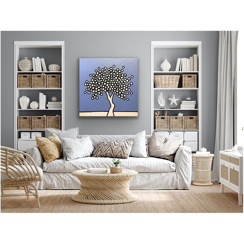
2. Should I use a colour wheel to decide what painting fits best in my home?
When it comes to decorating your home, the colour palette you choose can be the difference between an impressive and inviting space or an unpleasant one.
While there are many things to consider when selecting colours for your walls and furniture, one of the most important factors is understanding how colours interact when placed next to each other.
The relationship between two colours is determined by their position on a colour wheel. This tool can help you decide which hues work best together in order to create a harmonious atmosphere.
For example, complementary colours – those that are directly opposite each other on the wheel – can create a dynamic contrast that brings out the vibrancy of both shades. On the other hand, analogous colours – those that are adjacent to each other on the wheel – will create a subtle blend of hues in your space.
Additionally, you can use colour theory to decide how much or how little contrast you want in your room. When choosing bolder shades, opt for higher-contrast combinations; if a more muted palette appeals to you, try using tones with low-contrasting undertones.
It’s also important to consider the size of your space; if you have a large room with high ceilings, you may want to add more drama by pairing brighter and darker hues together.
Conclusion
As you can see, a colour wheel is a great tool for anyone looking to choose the perfect colour scheme for their home. Whether you want to make a bold statement with complementary colours, or create a subtle and calming atmosphere with analogous tones, the colour wheel provides an easy way to explore the possibilities and decide which works best for your space. With the right colour combination, you can transform your home into a stylish haven that reflects perfectly your individual style.